Deskripsi
Radius Blocks is the best WordPress Gutenberg blocks plugin that you can use to enhance the functions of the default WordPress block editor. The plugin boasts many blocks that enable you to create an elegant website without having to work with a coding expert. It has powerful controls and many styling options so that you can create and style page blocks, therefore, elements.
👉 Plugin Demo | Documentation 👈
🏆 Reasons to Love Radius Blocks
Easy Integrations – Whatever niche you want for your website, Radius Blocks enables you to create the best possible pages and posts. It integrates smoothly with any plugin or theme you need for your site’s functionality, including WooCommerce and learner institution plugins.
Easy Customization – Radius Block comes with many options for customizing everything you want with just a few clicks using the Gutenberg customizer. Each block is perfectly curated to give you a smooth user experience. It has a robust page-building feature that makes creating unique web pages easy.
Fast Performance– The website you end up creating with Radius Blocks will work fast because all the elements are optimized to operate smoothly. What’s more, the plugin is lightweight, and this will translate into all the blocks you use on your site.
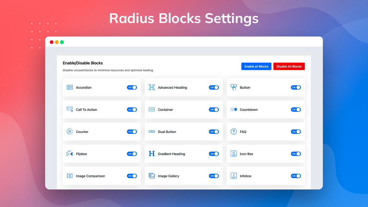
User Friendly Controls and Permissions – It is incredibly easy to create a website using Radius Blocks because all you need is to pick the block you need from the options. Moreover, you can enable or disable any block with a single click from your admin dashboard. You can decide and schedule when specific blocks display and restrict users easily.
🏆 Compatibility with Gutenberg Assures
Frontend Styling – Radius Blocks will enable you to style your posts within the Gutenberg editor or the front end. The blocks it offers retain their integrity and elegance even with extensive customization.
Theme Settings Inheritance – As you work with Gutenberg, you will find that the rest of the default blocks will inherit the settings you brought in with Radius Blocks.
Full-width Gutenberg Block Support – The settings that come with Radius Block work smoothly with full-width blocks. This plugin allows you to create, customize, and display elegant blocks like galleries, cover images, and full-width posts.
🏆 Radius Block Gutenberg Blocks Library
Header and Footer Blocks
Radius Blocks come with header and footer blocks that are ideal for creating beautiful headers for your website.
-
Header info
You can display header information dynamically using the header info block that Radius Blocks offers. It allows you to insert whatever informative content you want on your header.
👉 Demo || Documentation -
Advanced Navigation
The advanced navigation block is ideal for adding functions to your headers and footers. You can utilize them by adding links and shortcuts to different parts of your website.
👉 Demo || Documentation -
Search
You can insert a search field into your headers or footers using the search block. Having readily available search boxes for your users makes your site easier for them to navigate and your content easier to find.
👉 Demo || Documentation -
Copyright Text
Having copyright text in your footer is easy with this plugin’s copyright text block. Copyright notices will help you protect all the content you post on your website against unfair use and other unlawful infringements.
👉 Demo || Documentation
Over 40+ General Gutenberg Blocks
-
Advanced Heading
You can create attractive headings for your content using the Advanced heading block. You will be in complete control of this block while enabling and disabling your header and customizing its style as extensively as needed.
👉 Demo || Documentation -
Accordion
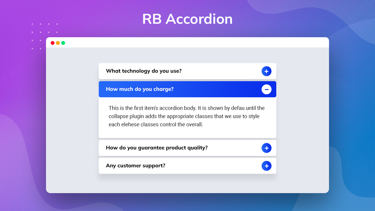
The Accordion block is the best way of creating and displaying a lot of content in a limited space. You get to create a unique collapsible item that showcases text and icons. This block also offers many design options.
👉 Demo || Documentation -
Advanced Video
The advanced video block takes the functions of the default Gutenberg video block to an entirely different level. If you want to incorporate some self-hosted videos, this block gives you many styling options, among other excellent features.
👉 Demo || Documentation -
Advanced Tab
With the advanced tab block, you can get creative when displaying much content in restrictive spaces. You get to showcase your tabbed content in a user and mobile-friendly manner. You can customize them with many more options, including color, margin, alignment, and padding settings.
👉 Demo || Documentation -
Advanced Image
The image block that comes with Radius Blocks is centered on the basic image block that Gutenberg offers. However, this one beats the default one with many additional features, such as overlays and custom text.
👉 Demo || Documentation -
Button
The Button block is based on the same default block in the Gutenberg block builder. It enables you to add a new button inside a page or post and customize it. Radius Block offers an improved version of the default one by adding many advanced features, including styling options like shadows, padding, margin, hover, and border.
👉 Demo || Documentation -
Call to Action
The Call To Action block enables you to create engaging CTAs to encourage your users to take action on your website. You can work with extensive customization options, including fonts and colors.
👉 Demo || Documentation -
Counter
The Counter block presents an elegant and easy way to display numbers and stats relevant to your campaigns and other site activities. You can change the style of the animated counter easily from the settings.
👉 Demo || Documentation -
Countdown
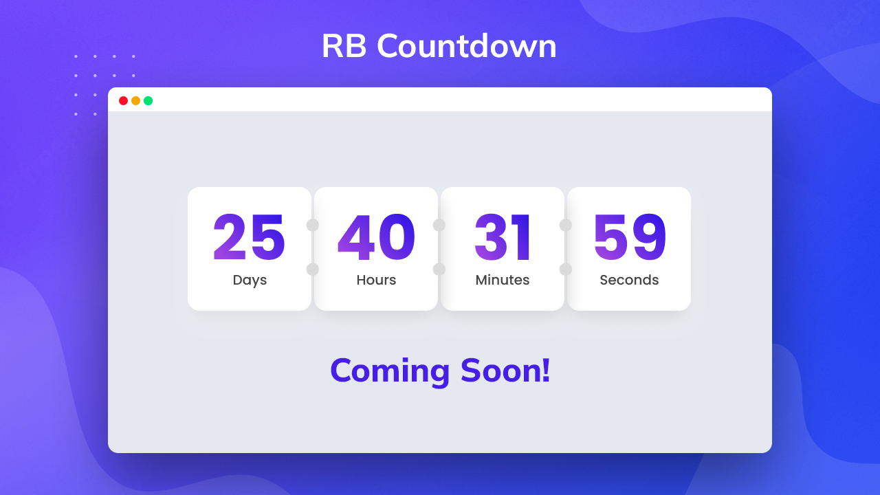
If you want to showcase countdowns to different events or offer deadlines, the Countdown block is perfect for this. You can customize your timer to display in different styles.
👉 Demo || Documentation -
Container
The container block lets you insert a new container in a single block layout.
👉 Demo|| Documentation -
Dual Button
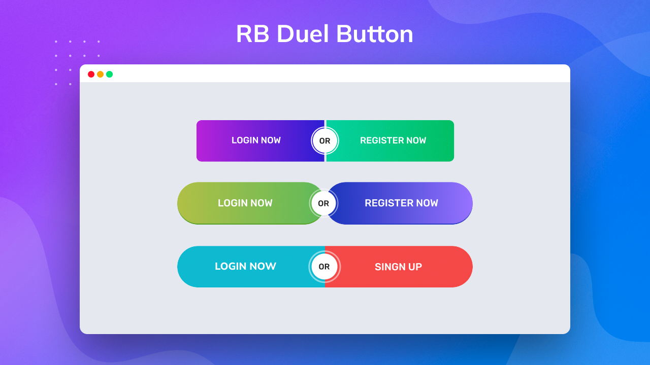
The Dual Button block is one that is unique to the Radius Block plugin. It enables you to display two individual buttons within a single block to serve a different or advanced purpose than the single one.
👉 Demo || Documentation -
FAQ
Add dynamic, frequently asked questions for your website products and services using the FAQ block.
👉 Demo || Documentation -
Flipbox
The Flipbox block offers a straightforward way of creating animation effects that flip the box over when users hover over it with a mouse.
👉 Demo || Documentation -
Gradient Heading
The Gradient Heading block is here to make your headings even more elegant. You can use it to create a colorful heading design with different styles and opacity angles from your settings.
👉 Demo || Documentation -
Icon Box
The Icon Box block is perfect for the task if you want to insert clickable service boxes, complete with icons, heading containers, and text containers.
👉 Demo || Documentation -
Info Box
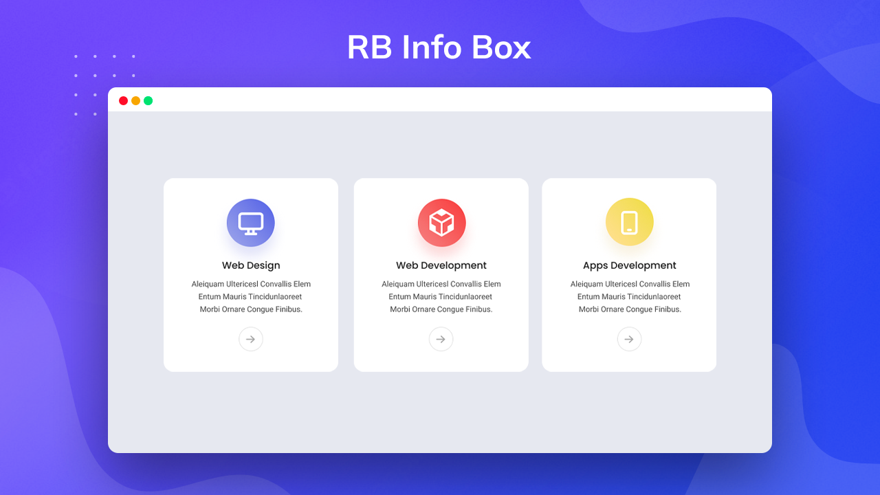
The Infobox block enables you to add an icon or image with a heading and details within a single block. You can even choose the icon or image you want and customize all the contents of the block.
👉 Demo || Documentation -
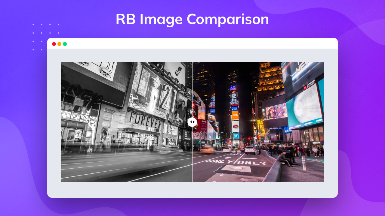
Image Comparison
The function of the Image Comparison block is as simple as facilitating the comparison of before and after images. You get a slider with the block for easier comparison.
👉 Demo || Documentation -
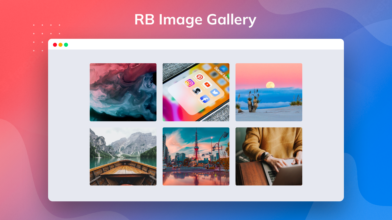
Image Gallery
The image gallery block allows you to showcase multiple images in a single gallery.
👉 Demo || Documentation -
Icon List
There’s no easier way of adding gorgeous icons to your lists to make them more attractive to your visitors than using the icon list block. It gives you access to more than 1000 icons with varying styles.
👉 Demo || Documentation -
Logo Grid
The Logo Grid is an excellent logo grid block that lets you display your logo inside different shapes on your pages as you showcase your brand identity.
👉 Demo || Documentation -
Post List
If you want to showcase your posts as a list, the Post List block is what you need. You can customize the order in which you want them to appear as well as thumbnails for the posts.
👉 Demo || Documentation -
Post Grid
Utilizing the Post Grid block fetches all the blog posts on your website and showcases them in a grid layout. You can customize the featured image, style, and order for their appearance from your settings.
👉 Demo || Documentation -
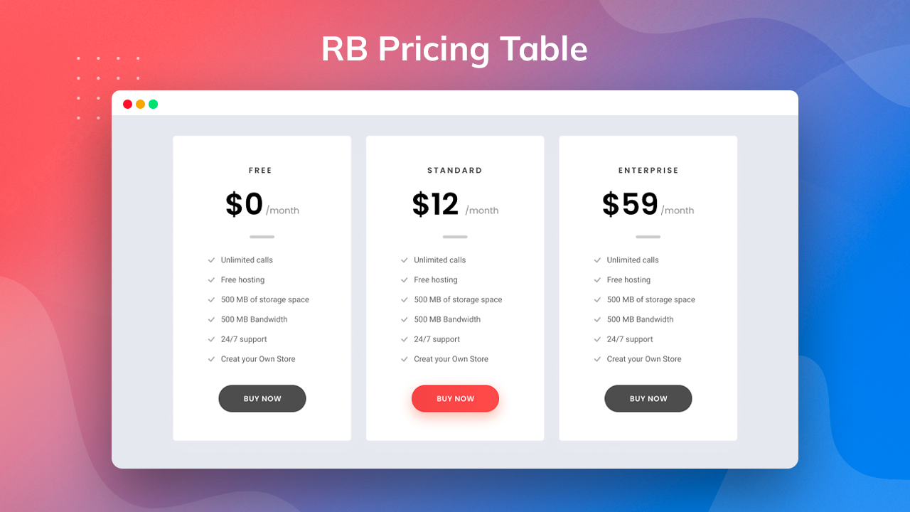
Pricing Table
The Pricing Table block enables you to generate and display a pricing table for products on your website. Its style customization options are ideal for creating a unique layout. You can use it to show the membership subscription options for your website.
👉 Demo || Documentation -
Progress Bar
The progress bar block is ideal for a website’s user-friendliness. Your users can monitor their progress as they read a post and return to where they left off.
👉 Demo || Documentation -
Row
The Row block is perfect for creating rows that nest blocks in adjacent columns or in the form of a container. You can style your rows with padding, background, and overlay options.
👉 Demo || Documentation -
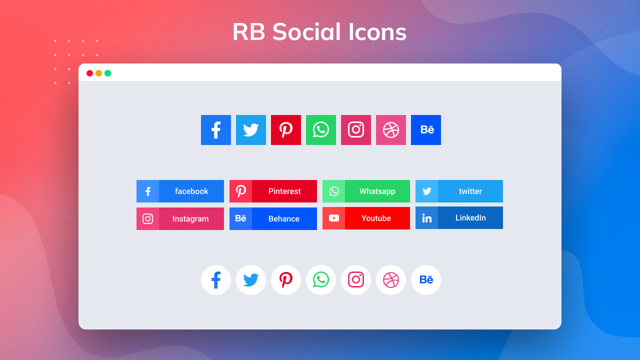
Social Icons
You can add any popular social icons in any area using the Social icons block.
👉 Demo || Documentation -
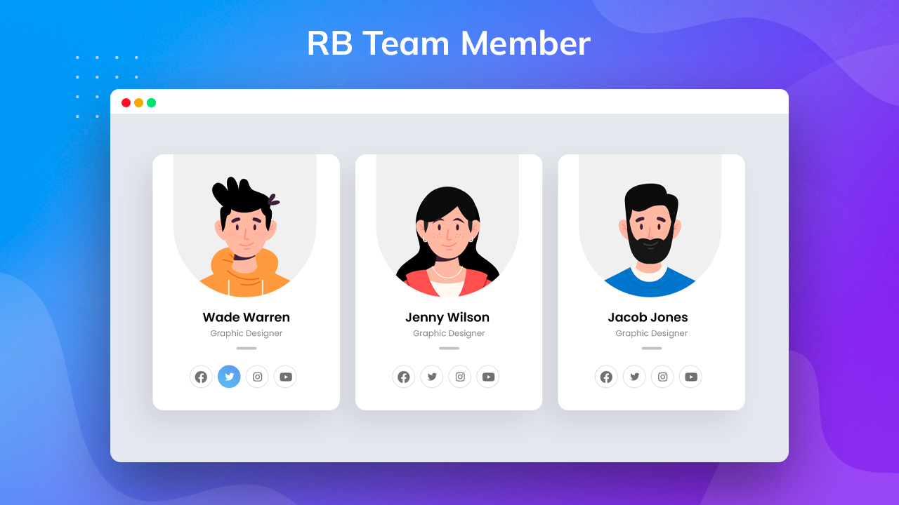
Team Member
The Team Member block enables you to display the team that helps you. You can showcase the team in a slider, isotope, or grid layout. It has multiple custom options, including choosing profile images for your team members to appear in rounded or square shapes.
👉 Demo || Documentation -
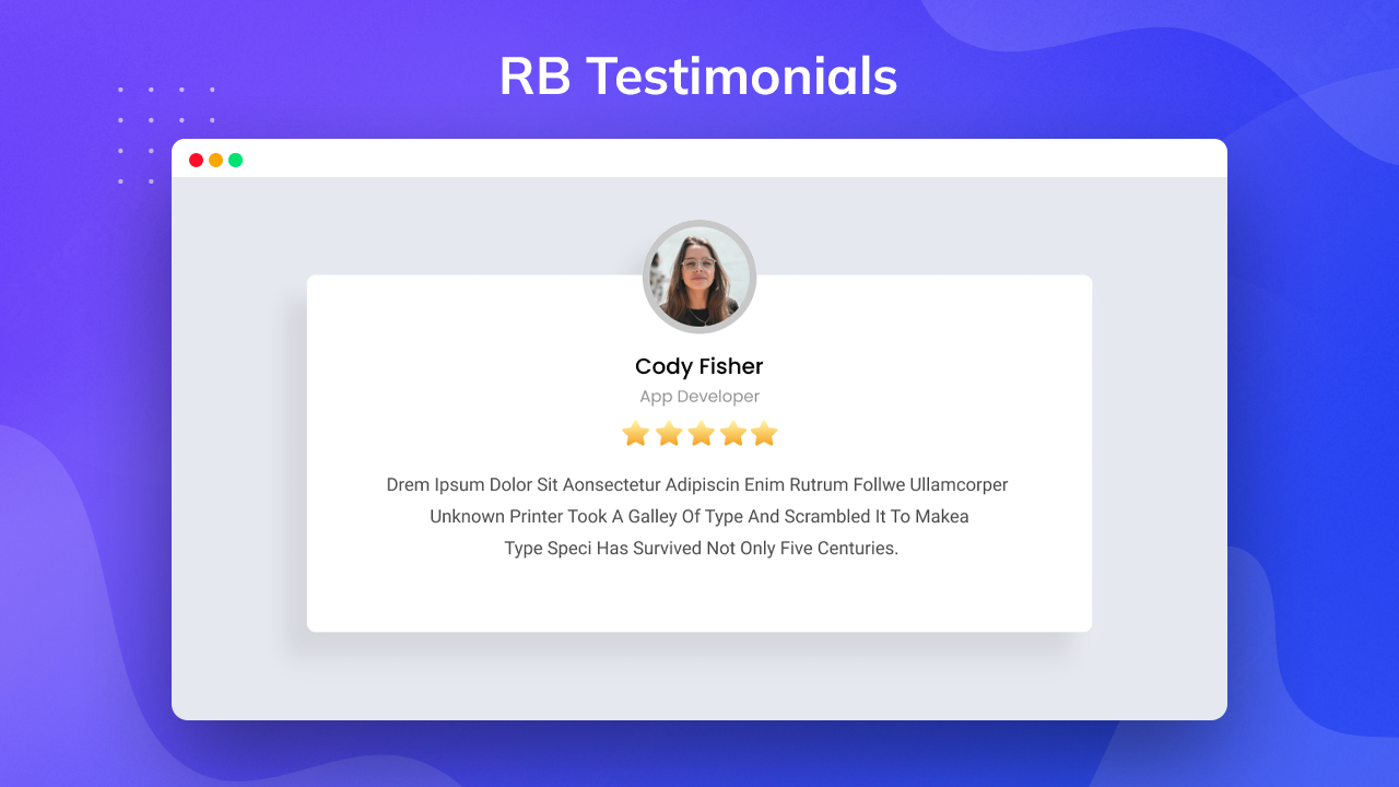
Testimonial
The Testimonial block allows you to showcase your customers’ feedback in the video, carousel and grid layouts. You can also choose the fields you want to appear on your front end from your settings.
👉 Demo || Documentation -
Post Carousel
Utilizing the Post carousel block fetches all the blog posts on your website and showcases them in a carousel layout. You can customize the featured image, style, and order for their appearance from your settings.
👉 Demo || Documentation -
Logo Slider
The Logo slider is an excellent logo slider block that lets you display your logo inside different shapes and slider layout on your pages as you showcase your brand identity.
👉 Demo || Documentation -
Testimonial Slider
The Testimonial block allows you to showcase your customers’ feedback in the carousel. You can also choose the fields you want to appear on your front end from your settings.
👉 Demo || Documentation -
Fluent Form
The Fluent Forms block allow you can create registration or subscription forms for your visitors. It’s a very useful block for collecting data. You can add various input fields like name, email, etc in your form.
👉 Demo || Documentation -
Contact Form 7
Contact Form 7 allow you to create an interactive contact form easily for visitors and collect data. You can add different input fields like name, email, phone number, message box, and checkbox in your contact form.
👉 Demo || Documentation -
Wrapper
The Wrapper block lets you add a container for a new block. You can set margin and padding from the settings.
👉 Demo || Documentation -
Notice
This block’s strong adaptability & flexibility help users quickly alter to suit their needs and allows you to customize various criteria to properly design and show your notices.
👉 Demo || Documentation -
Post Timeline
You can exhibit a grid of posts on your WordPress website with the Post Grid Block. It is used to build a portfolio and a listing of blog posts and is simple to customize with many parameters.
👉 Demo || Documentation -
News Ticker
Display breaking news in your website’s header while maintaining the quality of your content with the Gutenberg News Ticker block. It gives your website visitors a dependable approach to highlighting significant news or announcements staying updated on recent developments.
👉 Demo || Documentation -
Dropcaps
This block’s strong adaptability & flexibility help users quickly alter to suit their needs and allows you to customize various criteria to design and show your notifications properly.
👉 Demo || Documentation -
Social Share
Craft sophisticated social media share blocks with icons, links, and texts using built-in positioning features.
👉 Demo || Documentation -
Image Accordion
Using the Image Accordion Block, you can show an image accordion on your WordPress website. It is used to create a shop page and is simple to customize with numerous parameters.
👉 Demo || Documentation -
WooCommerce Product Grid
Aesthetically showcase your products with ease by designing flexible layouts, personalizing them according to your preferences, and emphasizing them in visually appealing ways.
👉 Demo || Documentation -
WooCommerce Product List
Woo Product List Block strongly emphasizes offering a comprehensive view of products, including addon features like sorting options, filters, and pagination that help efficiently navigate several product pages.
👉 Demo || Documentation -
WooCommerce Product Carousel
The fundamental purpose of establishing a visually captivating browsing experience for users lies in actively presenting product images and concise descriptions, including the ability to determine synchronously displayed products.
👉 Demo || Documentation
Need Any Help?
- For any bug, support or suggestion please submit your ticket here.
Tangkapan Layar
Blok
Plugin ini menyediakan 47 blok.
- Image Gallery Display multiple images using an image gallery block
- Post Grid Display your posts in a grid layout using this block
- Icon List Create attractive horizontal or vertical lists with icons
- Header Info Create attractive horizontal or vertical header info with icons' attention
- Wrapper Blocks are displayed in a wrapper
- Notice Display news, announcements on the header with notice block
- Logo Slider Display your company logo with the name using the logo grid block
- Advanced Heading Create advanced heading, sub heading and sub heading bar using one block
- Dual Button Create different type dual-button with dual-button block
- Progress Bar Insert a visual indicator that displays what percentage of a process has been done
- Social Share Share your posts & pages in social network platforms using this block
- Team Member Display your team member profile with team block
- Post Carousel Display your posts in a grid layout using this block
- Accordion Display expanded text with Accordion/Toggle block
- Woo Product Grid Display your WooCommerce product in a grid layout using this block
- Advanced Tab Display the content with images under different tabs
- Image Insert an image to style a visual statement the ultimate controls
- Social Icons Add your social media profile with a social icons block
- Pricing Table Display the different product pricing and perfect styling for your business
- News Ticker Display the latest news and posts using this block
- Logo Grid Display your company logo with the name using the logo grid block
- Gradient Heading Create gradient heading, sub heading using one block.
- Countdown Display client feedbacks with countdown block
- Call To Action Create an interactive CTA block in your website to get the visitors' attention
- Advanced Video Add YouTube, Vimeo URL, or locally hosted video to make a video
- Advanced Navigation Add navigation in the header, footer & pages of your website with organized styling
- Counter Counter block is creatively counter/fun fact box
- Woo Product List Display your WooCommerce product in a list layout using this block
- Info Box Display your content creatively informative box with an animated info box block
- Search Display search block in the header will help visitors find your content
- Button Create different type button with radius blocks button
- Icon Box Compare two images using this block
- Woo Product Carousel Display your WooCommerce product in a carousel layout using this block
- FAQ Display questions and answer with faq block
- Dropcaps Display paragraph first latter drop caps with dropcaps block
- Post List Display your posts in a List layout using this block
- Testimonial Slider Display client feedbacks with testimonial slider block
- Image Accordion Display expanded text with image accordion block
- Post Timeline Display your posts in a timeline layout using this block
- Row Add row and column layout and displays content in multiple columns
- Image Comparison Compare two images using this block
- Flipbox Display different types of content flipping side on hover using a block.
- Testimonial Display client feedbacks with testimonial block
- Copyright Text Display copyright text with dynamic year in the footer
- Fluent Form Insert a registration or subscription forms for your visitors collecting data
- Contact Form7 Display contact form 7 and styling forms for your visitors collecting data
- Container This Block is Flex Properties Based Container
Instalasi
👉 Using The WordPress Dashboard
- Navigate to the ‘Add New’ in the plugins dashboard
- Search for ‘Radius Blocks’
- Click ‘Install Now’
- Activate the plugin on the Plugin dashboard
👉 Uploading in WordPress Dashboard
- Navigate to the ‘Add New’ in the plugins dashboard
- Navigate to the ‘Upload’ area
- Select
radius-blocks.zipfrom your computer - Click ‘Install Now’
- Activate the plugin in the Plugin dashboard
👉 Using FTP
- Download
radius-blocks.zip - Extract the
radius-blocksdirectory to your computer - Upload the
radius-blocksdirectory to the/wp-content/plugins/directory - Activate the plugin in the Plugin dashboard
Requirements
- WordPress version: >= 6.0
- PHP version: >= 7.4
Tanya Jawab
-
How to Use Radius block
-
- Go to
edit a content using Gutenberg Editor then find the Radius Blocks Blocks
- Go to
-
How I will get support?
-
- For any bug, support or suggestion please submit your ticket here.
-
Is this Gutenberg Blocks work with other page builder?
-
- Radius Blocks work only with WordPress Gutenbarg Editor. You can use other page builder but when use Gutenberg editor it will work.
-
- Yes you can build Header & Footer using Radius Blocks.
-
Is this plugin can use in archive page?
-
Can I control style?
-
- Yes you can style and control from blocks settings.
Ulasan
Belum ada ulasan untuk plugin ini.
Kontributor & Pengembang
“Radius Blocks – WordPress Gutenberg Blocks” adalah perangkat lunak open source. Berikut ini mereka yang sudah berkontribusi pada plugin ini.
KontributorTerjemahkan “Radius Blocks – WordPress Gutenberg Blocks” dalam bahasa Anda.
Tertarik mengembangkan?
Lihat kode, periksa repositori SVN , atau mendaftar ke log pengembangan melalui RSS.
Log Perubahan
2.1.1 ( December 26, 2023 )
- Fixed: Gradient Heading bock js issue fiexed
- Fixed: Block sidebar settings css isuues fixed
- Fixed: Countdown block setting css issue fixed
2.1.0 ( September 26, 2023 )
- Add: Plugin deactivate feedback form
- Add: Flip action on clicking of FilpBox block
- Fixed: Flipbox block css issue fiexed= 2.0.2 ( September 7, 2023 ) =
- Fixed: All block settings advance section background control error fixed
- Fixed: Contact form block error fixed
- Fixed: JS text translate and make pot file= 2.0.1 ( August 16, 2023 ) =
- Fixed: Fluent Form css file not found issue
- Fixed: WooCommerce product grid and list block image style control not working
- Fixed: WooCommerce product carousel advanced control fields not working frontend
- Fixed: Social Icons block icon type check issue= 2.0.1 ( August 16, 2023 ) =
- Fixed: Fluent Form css file not found issue
- Fixed: WooCommerce product grid and list block image style control not working
- Fixed: WooCommerce product carousel advanced control fields not working frontend
- Fixed: Social Icons block icon type check issue
2.0.0 ( June 1, 2023 )
- Added: News Ticker Block
- Added: Notice Block
- Added: Post Timeline Block
- Added: Dropcaps Block
- Added: Social Share Block
- Added: Image Accordion Block
- Added: Woo Product Grid Block
- Added: Woo Product List Block
- Added: Woo Product Carousel
- Fixed: Carousel in container broken issue
- Fixed: Blcok disable from setting show console error
1.1.0 ( May 23, 2023 )
- Added custom CSS write option for all block
1.0.5 ( May 5, 2023 )
- Frontend icon render error solve
1.0.4 ( April 17, 2023 )
- Fluent form console error solve
1.0.3 ( April 13, 2023 )
- FAQ block and CSS issue fixed
1.0.2 ( March 30, 2023 )
- Updated to WordPress 6.2 and CSS, Advanced tab issue fixed
1.0.1 ( March 20, 2023 )
- CSS issue fixed
1.0.0 ( January 23, 2023 )
- Final version release
0.1.1 ( November 24, 2022 )
- Update block description
0.1.0 ( September 13, 2022 )
- Initial beta release
